
Moetal
-
Posts
4058 -
Joined
-
Last visited
-
Days Won
1
Everything posted by Moetal
-
 Moemon Fire Red Revival Project Rejoice, moe friends and moe lovers! After countless hours battling bytes and pixels, we've completed a Moemon Patch! In addition to the updates BakaSchwarz did to his patch and the updates in previous Moegar/Moetal editions (which can be founded at the link below), we've sprited, editted, and added tons of cute sprites in game. Project RESTART In progress Moemon Fire Red Revival Project FAQ: *Read first before posting questions* Download: Moemon IPS Patch (Revival Project 2.6, for Fire Red) <--- This is the latest patch https://www.sendspace.com/file/x7cu1s Older Downloads: Change Log: Link: BakaSchwarz's Patch https://forums.pokem...dated-graphics/ Moemon Activation Guide...? https://forums.pokem...age__hl__moemon Old Locked Topic https://forums.pokemmo.eu/index.php?/topic/11707-ips-moemon-patch-moegar-feb-2013-version/ Discord for Moemon https://discord.gg/bC6RwQp Moemon Patreon (If you would like to support) https://www.patreon.com/moemondevelopment Extra: Credit to numerous Japanese sprite artists, BakaSchwarz, RacheLucario, McMagister, DiaryProduct, Eggplant, Kickern, CrookedWings427, laGashetaHardcore, toottoot and other spriters and updaters. (Please let me know if I missed your name) Please feel free to let me know if there's any error, or if you have found sprites that are more moe than the ones in the patch currently. *Trainer Magikarp-tan not included, please feel free to add her in yourself. https://www.mediafire.com/?9ufmugixr02rl2m (Credit to Kickern)
- 6257 replies
-
- 59
-

-
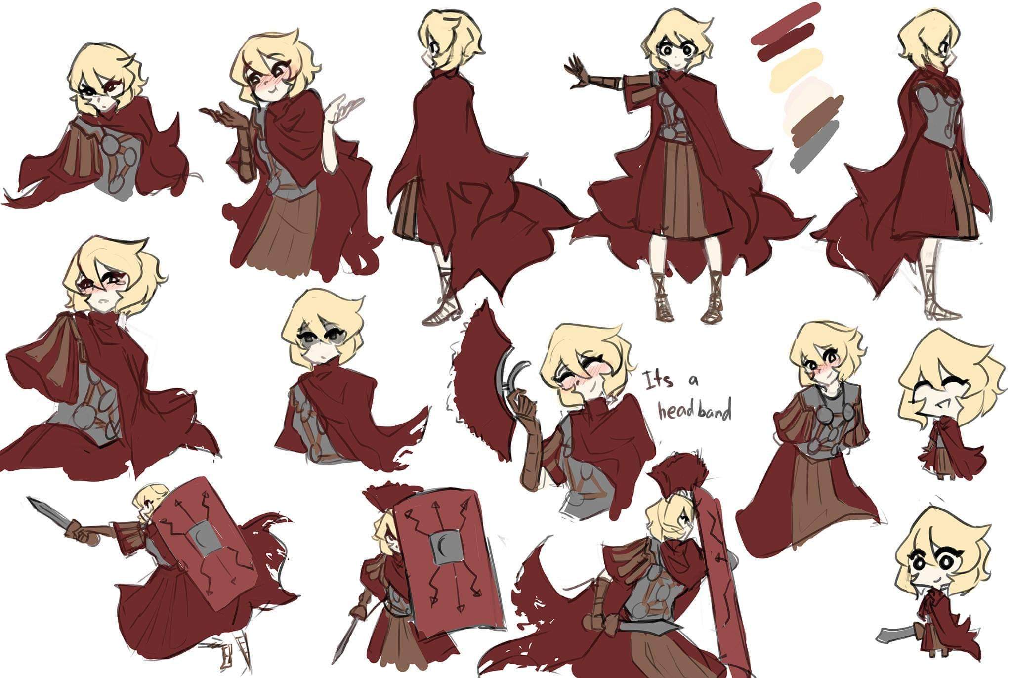
@Magi So no other tuning for the starter sprites, correct? I'm going to import them into the game if so. I've seen this sprite before, but yes, the lack of Metapod and Butterfree sprites made it impossible for me to use previously. This sprite has a good back sprite and hair. If you re-line the eyes with black instead, the front should look pretty good. Edit: As always, first two rows are what we have in game, and last row being just a size reference. While this 'new' Caterpie is pretty good, it's simply too large for us to use. I rather just fix up the current one or start from scratch. I'd say you should fix up the eyelash of the 'new' Caterpie and use that head on another Moemon in the future. Ideally Caterpie should be no taller than Gloom if standing.
-
[spoiler]It's fine. Children won't know the difference. They'll eat up anything you throw at them.[/spoiler] Are we going with your Charmeleon's eyes or my eyes?
-
@Magi I know, but I rather they look more uniformed here than following that closely to the original. Edit: Also [spoiler]Captured by children and forced to breed and battle with other moe for the sake entertainment. Jeez, I sure wonder why their eyes ain't pitch black bowls of doom and despair.[/spoiler]
-
@Magi Can you sync the reds/oranges/yellows too? At least partial so it looks more uniformed than jumping all over the place. Edit:
-
@Magi Sounds good. They look alright now. I kind of want to resync the three Charmander colors (general colors, eye colors since Charizard is blue eyes now). Can you do that while I go reshade Ivysaur's/Venusaur's/Dragonite's eyes? Edit: I corrected the wrong sprite for Charmander by the way. Please use the shorter leg version you made in addition to the changes I made to the eyes.
-
@Magi Front is perfect. Edit: You can probably add a pixel or two on the left side of the mouth to make the shape better tho. Back's neck is a bit long. Consider darkening the medium skin tone by a tiny bit. Now I want to be greedy and want Princess Venusaur too (head change at least). [spoiler][/spoiler] Edit: Went back to shade the eyes like Aozone.
-
@Magi Grumpig. Edit: Or Glalie.
-
@Magi Not fond of the shade pixel on top of the mouth line. Other than that, it looks alright now.
-
@Rache Naw it looks better without the shading.
-
@Rache Fix 2 feels better than fix 1. Try adding more shading to the left side of the face.
-
@Rache I said too close together, not make the left eye fatter. @Magi Horizontal flip it and tell me it doesn't look funny. Progress is good. Check that left leg tho. The wings can use a little more spikes.
-
@Rache Eyes feels too close together @Magi I like my style more. Too much eyewhite/highlight at the moment.
-
So this is what we have so far. I can't help but feel Charmander is bigger looking than our Charmeleon. I think the Dragonair in the last row looks better than our current one, so I'll probably replace it.
-
@Magi Individual patches probably will glitch things up here and there eventually. It's wiser to keep it as one big file, and anyone who cares enough can and will manually swap out the sprite they don't like. Rache or someone else can release a separate patch. I can release a second variation patch if a large population dislike a certain sprite and want another, although with 386 Pokemons, I really don't want to go into that field. @iara Search up NSE2.0 @Rache Instead of enlarging the body more, I shrinked the head in this attempt instead. See if this is better.
-
@iara That Starmie is an outdated version. We are using this Staryu as Staryu And this Staryu (recolored) as Starmie You can grab your own tools and swap sprites yourself.
-
@Magi Charmander's backsprite looks funny with the bumps, and the excessive highlights make it feel like a bundle of yarns. Try smoothing it out and remove most of the highlights on the hair that's below the neck. Also, the front bang feels flat/pressed against the forehead at the time, so I think it would be better if you can show the nose ridge/the section between the eyes. Alternatively, see below and make the front stick out a bit for more volume. I can't help but feel that chest is slightly a bit much if we are using her as Charmander.
-
@Rache I tried. Edit: Slightly more shading on face to separate the face from hair. Minor eye fix? Also added curl because. Edit again: I have no idea what I am doing anymore.
-
@Magi [spoiler][/spoiler] Muh princess when? Also [spoiler]It's time for your shot. [/spoiler]
-
@Magi And a variation where I moved the tail up. Edit: And long hair - hair-tail version because.
-
@Blinky Delinquent Charizard clashes too much with our current Blastoise. You can't get any more rough and tumble than a girl with two massive cannons. Edit: This is what one of the Dragonite replacement looks like. I've previously told Magi about using it as a base to edit it to Charizard, but I'd honestly rather have scratch built 4 head tall Princess Charizard instead. Imagine this tho: [spoiler]I-it's not like I want to be a delinquent or anything, b-baka! Don't get the wrong idea! I just had nothing else to wear.[/spoiler] @Magi ^ Go ahead and turn this into 'Charizard' into Charmander. Make a backsprite for this Charmander, then work on Princess Charizard huehue. Edit: @Rache Add some more white highlight to the hair of the Fearow and redefine the front hair bangs a bit with the dark red/brown tones when you get a chance.
-
@Rache Really? I thought I made sure to index it back to 16... oh well. @Magi Pidgeot is okay-ish, but some edits to her eyes and hair would be nice. Like I said, I'm not really fond of her current hairstyle, especially the two color streaks. I know how the original looks like, but I want a redesign to present that better. Not a fan of those sidetails. I like the pose, but I can't help but feel something is off about it. Let me experiment with it a bit, hold on. Edit: Right wing moved closer to body, head more to the left, reshape horns. Those large sidetails seems like an overkill/too out of character. Cutting it down to one of them is still on borderline. Why you no model after Pocket Princess? Lastly, doesn't she feel kind of chibi/childish compare to the other final stage starters? Honestly speaking, I'd rather crop the horn, sidetails and wings and use this as Charmander. --->
-
@Rache I'm just throwing down general design changes. I know you and Magi can do a better job than me on technical aspects, so I'm not going to bother with it. The crest feels more fitting to the original if it was just the ahoge, but full head red does contrast her better. Both are acceptable.
-
@Rache I tried merging the two together. Yellow-brown hair feels more fitting to Fearow than red hair, but I'm a sucker for blondes so to hell with my opinions. Edit: Remember you don't always have to start from scratch. Feel free to edit or steal parts from other Moemons.
-
@Rache If we are editing sprites, we might as well make sure everyone gets a bit of treatment. I'm not fond of her eyes or hairstyle to be honest, it's not as 'Pidgeot' as I want it to be. First two rows are what we have in game as of the moment. Third and fourth rows are what I have as either base or reference to work with. The Fearow the other artist did has a good face, but the mask doesn't really bring out Fearow.