


Noir
-
Posts
40 -
Joined
-
Last visited
Posts posted by Noir
-
-
Boop.
-
-
That'd be pretty fun, let me know if it's gonna happen.
-
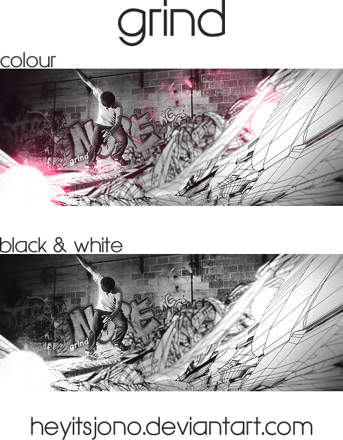
Done, sorry for the wait.
Colour:

Black/White:
The text placement/final design effects look pretty shitty because photoshop crashed right as I added the text, and all I could save was a screenshot. But yeah, hope you like it.
-
It looks too busy. Try making the text a brighter color and maybe put the images on overlay or lower the opacity. The focal point currently is not on the text, where it should be on a signature. Good luck with the changes!
How would you guys think about my signature?
This one?
It's quite nice as far as typography goes, the subtle glow on the green in CLOUDVOX does wonders for the overall effect, and I like that it's not over-sharpened and you haven't spammed it with shitty flares among other effects. Transparent background gets an A+ because it probably wouldn't work with much else without ruining that nice clean theme you have going on and the CLOUDVOX font is a perfect match to that theme. The only thing I would really criticise here is the Timeless Designer part. You have to be careful when picking script fonts like that for a 3D typo, you'll be hard pressed to make them look good and that's the issue here. Because the weight of then font is not large, the effects on it look cloudy, blurred and dark. You don't get the variety in lighting or the subtle effect which exists in the CLOUDVOX font because the script is simply too light to make it work. I'm also not really a fan of the 3D effect on it, it kinda looks like a weird thick black stroke and doesn't go too well with it. TLDR; CLOUDVOX part looks great, Timeless Designer part needs a font re-think. Overall, I like it.
-
If I can enter stuff I've already done (not like heaps old just like the most recent thing I've done) then I'd be interested, don't have much time to be making heaps of new stuff.
-
-
Sweet, once I finish the current request I'll take a look for a few good renders and send you a list to see if you like any of them. Also, you don't have to donate anything, I'm doing these for free right now. Donations are defs appreciated but don't feel any pressure :)
-
I really like your work :o
Could you do one with my username and this render?
I'll donate to you in game if you want :3
Sure, someone else has requested me so I'll do yours after I get to theirs. That render is a bit poor quality so it might be a bit hard to work with, do you have anything non-3D model? If you have your heart set on that one I can do it but I'm not sure it'll turn out the best :P If you can't be bothered finding another one, you could tell me what to search and I can send you a list of good suggestions, otherwise I'll just use that one.
-
-
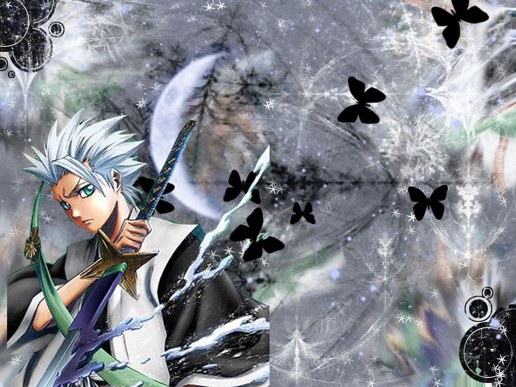
Aww yis I love Hitsugaya. Sure :) For future reference a render is when the character is on a transparent background these are stocks but I can work with these too. I'll try my best, but I might PM you to ask if you're ok with a different Hitsugaya render if I see one that's easier to work with.
-
Depends how big you want it.
-
Homie do you make sigs?
Sure do! If you want to request anything I'm pretty picky with renders though.
-
FIrst sig ever, just got into photoshop. Any constructive criticism?

Also didnt really wanna post it after those beautiful ones up there
Edit: Heres my 2nd one

I like it a lil better
Edit2: Incoming more attempts xD


Most of your stuff is overly-sharpened, and this is only emphasised by the animation which requires saving in .gif format which induces heaps of quality loss by itself. For those just starting out, I would advise you to stay away from animated tags. I know they're a huge thing on this forum but a lot of them tend to come out looking pretty tacky especially due to the .gif quality loss. Stick to static tags for now and work on improving your sense of flow, lighting and depth. Rather than just making a random background and wacking on a render and some text, try experimenting with the placement of a render relative to the background effects you are trying to achieve and have a background which complements both your render and the overall atmosphere of the tag. It's generally advisable to stay away from text when starting out because it ruins flow unless you do it right but it's up to you (I'm a bit of a hypocrite here since the text in p much all my tags screws up the flow). I will say though that you needn't use massive font sizes and overly garish effects on your text, rather you should go for a more subtle approach which matches the style of the tag. These are great for your first shots at tag making and they're a lot better than what I first whipped up when I was getting into it, just give it time and practice and you'll improve massively. :)
---
Back from hiatus with a new tag, CnC would be wonderful!
-
Aww yeah, Homestuck Fans :3
(My patron troll is Aradia)
And your stuff looks great *-*
Cheers mate :)
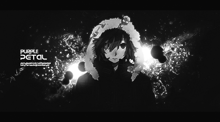
Coming back from the dead with a brand new tag.
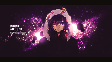
Don't ask me why I made a B/W version of a tag called Purple Petal lmao. But yeah, exams are finally over and so is school so time to get back into tagging and GFX.
-
Boop, update:
-

Very nice, although the text unfortunately ruins it. It draws a double-focal due to size and clashing colours/shades with the tag itself. Might be better if you get rid of the Stroke around it but it also goes against the tag's flow which is a problem. I'd put this at 8/10, it's good :)
Ooft, just finished making this one it took agessss. Used it to practice creation of flow/depth and proper lighting. Let me know how I went, as always CnC is welcome and appreciated, thanks! :)
-
The question needs to be asked...
Patron trolls? (Corresponds with astrology sign if you didn't know)
Lel, Equius. We should make a Homestuck/MSPA thread in Off Topic and move the discussion there, I'm kinda curious to see if there's other homestucks.
-
Omg me neither!~ o3o
I'm not very far though :<
I stopped and then heaps of updates came xD
I'm 1000 pages over halfway, 4000 pages to go x3
I miss archive reading, waiting for updates sucksssssss
-
I'm a ways back on updates, but I plan on catching up again soon(TM)
There's plenty of time to do it now what with the gigapause and all hehe
Omg more homestuck fans <3
I love that Harley sig Noir <3
Thanks! I had no idea there were fans on Pokemmo O:
-
Nice work ^_^
Thanks :)
A-WE-SO-ME
I need learn more about graphic edition, for doing a pieces of art like this!
Are u thinking in doing some signs for request?
Thank you! I'm planning to accept some requests in the future but probably not for a while 'cause it's exam period right now.
so i herd u leik homestuck
Can't get enough, dat gigapause tho ):
-

Hey guys, I thought I'd make a showcase for my stuff since I've started to get back into GFX as of late. Any CnC is welcome and appreciated. Thanks :>
Newest to Oldest:
[spoiler]
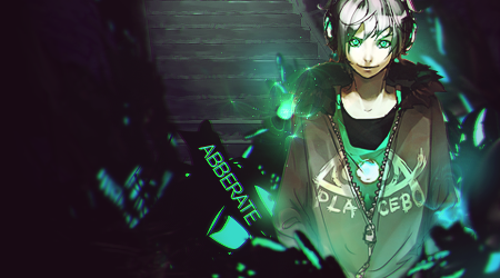
Abberate
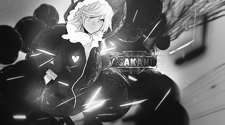
Asakano [Requested by Asakano]
Toshiro Hitsugaya [Requested by JIceJDragon]


Purple Petal
Grind
Jade Harley

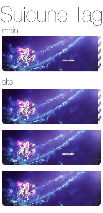
Suicune
Raid

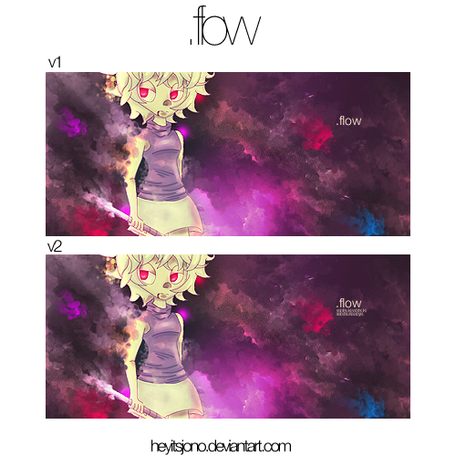
.flow
Tensa Zangetsu

Charizard

[/spoiler]
deviantArt for my large stuff and typography.
- KameKun, bubblefish4 and Musica
-
 3
3
-
Rate my signature?
[spoiler]And display picture while you're at it since I made that too. :)[/spoiler]
6/10, the text is rather large and invasive (although that seems to be pretty popular here so fair enough), and it disrupts the flow (which makes me sound like a hypocrite cause the tag I'm about to post has crappy flow). Because it's so big it also acts as a double focal which is a problem as it draws attention away from the Chansey render. The background is a little plain and the foreground grunge effects, while adding a bit of depth, serve as a distraction from the tag. You may want to consider adding those effects to the background as a means of keeping the render as your focal and also spicing up your background. The colour scheme is nice and matches the render, in the future you may want to try adding a little bit of pink in there too to further integrate the render into the tag.
Just finished a new tag, completely new style for me and my first time smudging properly. CnC is welcome and appreciated :)
(tfw the flow and lighting are shot :c )
-
I don't mean to offend, but this really isn't worth the amount of money you're asking for, I suggest you lower your prices. Although if people are willing to pay then I hope it works out for you.
- Evesa, Akshit and bubblefish4
-
3
[Sig] Signature Rating Thread
in Creative Media
Posted
This is awesome man, I love the colours.
newwwwwww: