I just installed the game earlier and have been loving it. There were, however, some problems and suggestions that came to mind while playing it.
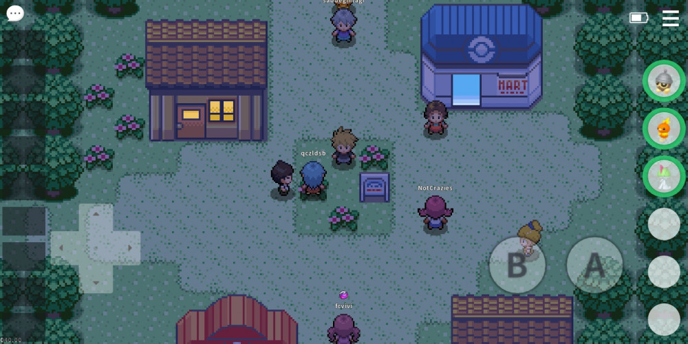
- The current UI is fine, but it could be better. I don't know what the slots on the left side of the screen does but because of it, the DPad of the game is positioned at a slightly difficult spot (for me at least T^T). It would be great if a single button was put in the upper-left side of the screen (below the chat button) that would show the buttons that were originally there, kind of like a "drop down list" or whatever it's called.
- Adding an option to customize the positions of the in game buttons (DPad and the A/B buttons) in the settings would be great as well. The current position of the DPad bothers me (possibly other presumable android users as well).
- The character's movements feel restricted or slow. This is probably the delay when changing directions while moving. In other Pokemon games, the character stops for shorter than half a second (guessed, not calculated) while the game makes the character stop for probably almost a second or less before continuing in the other direction. This might be to counter some bugs (?), I don't know. But it feels weird.
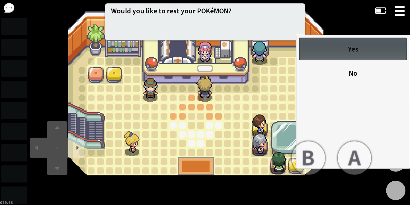
- The dialogue boxes and choices (especially the ones that Nurse Joy, if she's still the Nurse at the Pokecenter, has-- The Yes/No option box) needs to be revamped. (This is a minor detail, but it would be cool if the edges of all dialogue bubbles were curved and if the pointer of the dialogue bubbles pointed at the upper-right corner of the head of the speaker instead of the top of the middle of their head.)
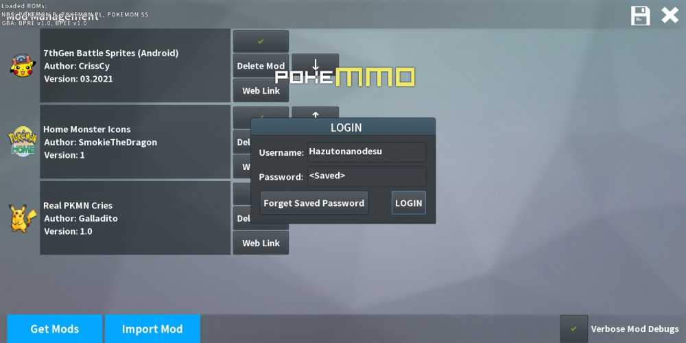
- The GUIs overlap. First time I noticed this was when I was logging in. Before the log in UI appeared, I tapped the side menu (The one that looks like this 三 at the upper right corner of the screen). It functioned properly, but when the [Loading... Please wait] finished loading, it forcefully overlapped with the current UI I was on, which was the Mods Management UI. I clicked on the background and it vanished. (Happened again when I did the same thing)
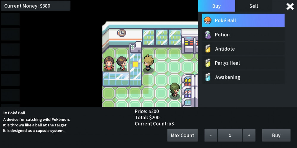
The second overlap happens at the Pokemart. It might be designed like this, but the buttons (The same buttons that I don't know the use of) on the left side of the screen didn't vanish or hide itself when the shop's UI is opened. Kind of feels clunky.
- The overall design and feels of the game's UI could use some reworks to give it a modern feeling. This one's not as important as the others though, just had the idea to put it here as well.
Most of my suggestions were probably (most definitely) stuff that only bothered me or something, but promise, I wrote this with the idea of improving the game's (Android version) quality.