Heimann Posted August 5, 2014 Share Posted August 5, 2014 Maybe a 6/10. Nice concept but it's too small and the resolution looks weird. What Hol said. Not to mention I know over 100 tutorials that would produce this in under 10 minutes. Plus ho ohs colors don't really blend well. Link to comment
Munya Posted August 5, 2014 Share Posted August 5, 2014 I can finally do this, sort of. All Feravynes masterpieces though Link to comment
Deejaye Posted August 7, 2014 Share Posted August 7, 2014 I can finally do this, sort of. All Feravynes masterpieces though you and feravyne's signatures twins/10 Fera 1 Link to comment
Hol Posted August 9, 2014 Share Posted August 9, 2014 Parallax! Heimann, Gunthug and ragstal 3 Link to comment
ShunGTX Posted August 10, 2014 Share Posted August 10, 2014 I was trying something different with the smugdes and brushes on this sig, so rate away! Link to comment
Jate Posted August 11, 2014 Share Posted August 11, 2014 I was trying something different with the smugdes and brushes on this sig, so rate away! 6.5/10 the render doesn't really fit, other than that it's pretty good!!! Link to comment
KingTsunami Posted August 11, 2014 Share Posted August 11, 2014 Just curious to see what you all think about this. It is nothing much really. But I am starting to slowly build on it. Link to comment
DrCraig Posted August 11, 2014 Share Posted August 11, 2014 Just curious to see what you all think about this. It is nothing much really. But I am starting to slowly build on it. AMAZING! Link to comment
Heimann Posted August 11, 2014 Share Posted August 11, 2014 Just curious to see what you all think about this. It is nothing much really. But I am starting to slowly build on it. 0/10 ? I don't get it. I was trying something different with the smugdes and brushes on this sig, so rate away! Love the background, not a fan of the render. Parallax! kawaii/10 Hol 1 Link to comment
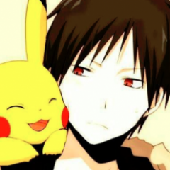
Heimann Posted August 11, 2014 Share Posted August 11, 2014 Rate mine? 5/10 Font is not fitting for itachi The effect of the font is way too birhgt the eye effect is slightly sloppy Link to comment
DrCraig Posted August 16, 2014 Share Posted August 16, 2014 vote mine?the render and text look like they are just like. There. Doesnt flow. I like that rain effect tho :p tinnguyen 1 Link to comment
CaptainSpectacular Posted August 16, 2014 Share Posted August 16, 2014 Why not, rate mine pweese Link to comment
DrCraig Posted August 16, 2014 Share Posted August 16, 2014 Why not, rate mine pweeseyou got 500x200, get everybody out of eachothers a ass :) Link to comment
Hol Posted August 23, 2014 Share Posted August 23, 2014 Thoughts on this one? Musica 1 Link to comment
DrCraig Posted August 23, 2014 Share Posted August 23, 2014 Thoughts on this one?6/10, its just a picture [spoiler]:)[/spoiler] Link to comment
LadyMori Posted August 23, 2014 Share Posted August 23, 2014 9/10 because it doesn't say [LONR] DRCRAIG :P Link to comment
ThatGoofyGoomba Posted August 26, 2014 Share Posted August 26, 2014 just recieved this, I think it was very well done but i would love to hear a real critique if you guys dont mind. ragstal 1 Link to comment
ItsKad Posted August 27, 2014 Share Posted August 27, 2014 Hey guys, Made my sig last night.... Just wanted to all of your thaughts! Im fairly new to Photoshop, but i am studying Digital and Interactive games (So, computer games) and ill need to use photoshop alot.... So i thaught i would give Adobe Photoshop a Spin.... So what do you guys think? How can i improve? What should i add? Thanks, ItsKad P.S its nothing compared to what some of you guys can do, But hey.... Its a start :) Link to comment
DrCraig Posted August 27, 2014 Share Posted August 27, 2014 just recieved this, I think it was very well done but i would love to hear a real critique if you guys dont mind. that sig is sweet 9/10 it just bother me that the top of the solrock and its animation is cut off :P Link to comment
Vorred Posted August 27, 2014 Share Posted August 27, 2014 just recieved this, I think it was very well done but i would love to hear a real critique if you guys dont mind. The used render is really ugly/generally bad and the animation is far too infrequent, though its a nice animation I do like the background and text though Link to comment
DrCraig Posted August 27, 2014 Share Posted August 27, 2014 Hey guys, Made my sig last night.... Just wanted to all of your thaughts! Im fairly new to Photoshop, but i am studying Digital and Interactive games (So, computer games) and ill need to use photoshop alot.... So i thaught i would give Adobe Photoshop a Spin.... So what do you guys think? How can i improve? What should i add? Thanks, ItsKad P.S its nothing compared to what some of you guys can do, But hey.... Its a start :)Need to tone the Stroke down a little bit, your border doesn't look smooth. The text font kinda bothers me and it should be a different color so it might stick out more. I like the concept though, and it suits the charmander render nicely. Link to comment
Hol Posted September 10, 2014 Share Posted September 10, 2014 I made something. I think the blood looks a bit weird though.. Musica, ThatGoofyGoomba and SneaKyKhaLidA 3 Link to comment
Heimann Posted September 10, 2014 Share Posted September 10, 2014 the mouth from the render looks very odd lol blood reminds me of dust bunnys Link to comment

Recommended Posts
Create an account or sign in to comment
You need to be a member in order to leave a comment
Create an account
Sign up for a new account in our community. It's easy!
Register a new accountSign in
Already have an account? Sign in here.
Sign In Now