KaynineXL Posted May 29, 2016 Share Posted May 29, 2016 Thoughts on my latest sig? ragstal 1 Link to comment
ShadowGray Posted May 29, 2016 Share Posted May 29, 2016 42 minutes ago, KaynineXL said: Thoughts on my latest sig? 10/10. The character and the font used for your text are perfect with this theme of snow. I really love it. KaynineXL 1 Link to comment
EeveeMarkable Posted June 11, 2016 Share Posted June 11, 2016 How is it? :3 ragstal 1 Link to comment
Heimann Posted June 11, 2016 Share Posted June 11, 2016 8 hours ago, EeveeMarkable said: How is it? :3 It could use alot o work Bad render Bad font You went crazy with outer glow to mask how bad the render is The black around the border is weird EeveeMarkable 1 Link to comment
EeveeMarkable Posted June 12, 2016 Share Posted June 12, 2016 10 hours ago, Heimann said: It could use alot o work Bad render Bad font You went crazy with outer glow to mask how bad the render is The black around the border is weird git gud me xD Thank You for your advice ^^ Link to comment
Argorok2017 Posted June 12, 2016 Share Posted June 12, 2016 (The Japanese was requested by the customer, not much I could do with it. Also, she's a vampire if you couldn't tell) (demolished background because a destroyed city was one of the big battlegrounds in this anime) (Used sci-fi font because the character is from Starcraft, which is a sci-fi game) Rate these? (comments were left to clear any confusion if questions had arisen) ragstal and Instagramlol 2 Link to comment
DiDi Posted June 12, 2016 Share Posted June 12, 2016 (edited) 9 minutes ago, Argorok2017 said: (The Japanese was requested by the customer, not much I could do with it. Also, she's a vampire if you couldn't tell) (demolished background because a destroyed city was one of the big battlegrounds in this anime) (Used sci-fi font because the character is from Starcraft, which is a sci-fi game) Rate these? (comments were left to clear any confusion if questions had arisen) 2 2 and -5 gross, stop, gg rekt EDIT: kuro one is fire Edited June 12, 2016 by DiDi Link to comment
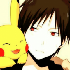
Zayre Posted June 12, 2016 Share Posted June 12, 2016 still learning, but rate this please. ragstal 1 Link to comment
Heimann Posted June 12, 2016 Share Posted June 12, 2016 7 hours ago, Zayre said: still learning, but rate this please. very simple text seems off (outer glow) no idea why you did a black border 4-10ish, nothing stands out to make you go 'wow' Zayre 1 Link to comment
Argorok2017 Posted June 12, 2016 Share Posted June 12, 2016 15 hours ago, DiDi said: 2 2 and -5 gross, stop, gg rekt EDIT: kuro one is fire Troll rating, can I get an actual one lol Link to comment
Heimann Posted June 12, 2016 Share Posted June 12, 2016 (edited) 15 hours ago, Argorok2017 said: render is terrible, blood ruins the background render has some weird outline text color is offputting ;looks like you slapped a render on a background and added text 0-2/10 same as above, except this render is ok text is poor choice , color&font looks like all you did was slap a render on a background again 2-3/10 render stands out too much lightning on render does not match anything in the background text is offputting yet again slapping a render on a background and adding text 1-2/10 Rate these? (comments were left to clear any confusion if questions had arisen) and stop slapping that black border on everything Edited June 12, 2016 by Heimann Link to comment
Argorok2017 Posted June 12, 2016 Share Posted June 12, 2016 25 minutes ago, Heimann said: and stop slapping that black border on everything dayum, someone's an ass lmao. You say it's just slapping a render on a background then I can say the same about more than half of these sigs I've seen on here. The reason I asked about a serious rating was because the person who rated it before is my friend who was trolling me, no need to be a uguu. Link to comment
Heimann Posted June 12, 2016 Share Posted June 12, 2016 2.) If you're going to be negative, always give constructive criticism as to why you feel that way 3.) In relation to rule 2, if you are on the receiving end of negative constructive feedback, please try not to take offense I gave you a serious rating. I could recreate any of those sigs you made within minutes, they literally look like you took stock backgrounds and plastered a render on them then added text and called it a day. Sorry that reviewing your work makes me a 'uguu' Link to comment
Argorok2017 Posted June 12, 2016 Share Posted June 12, 2016 5 minutes ago, Heimann said: 2.) If you're going to be negative, always give constructive criticism as to why you feel that way 3.) In relation to rule 2, if you are on the receiving end of negative constructive feedback, please try not to take offense I gave you a serious rating. I could recreate any of those sigs you made within minutes, they literally look like you took stock backgrounds and plastered a render on them then added text and called it a day. Sorry that reviewing your work makes me a 'uguu' No I've seen the other ratings you've given to other people, and you were nowhere near as much of an ass as you were for my ratings. Link to comment
Heimann Posted June 12, 2016 Share Posted June 12, 2016 Just now, Argorok2017 said: No I've seen the other ratings you've given to other people, and you were nowhere near as much of an ass as you were for my ratings. If I was an ass I would of quoted soothe to describe your work. Please stop being triggered, I didn't say it was shit, I didn't tell you to uninstall photoshop or w/e you use, I haven't bullied you, I gave you what you wanted. A honest review. Hol 1 Link to comment
Zayre Posted June 12, 2016 Share Posted June 12, 2016 2 hours ago, Heimann said: very simple text seems off (outer glow) no idea why you did a black border 4-10ish, nothing stands out to make you go 'wow' thank you. first time using a fire background, so i have no idea if it's fine or what so. i'm bad anyhow, though. Link to comment
Platoons Posted June 23, 2016 Share Posted June 23, 2016 Watched a tutorial on clipping masks, used the guys resources, heres the outcome. PS: not a huge fan of the font so just ignore it for now. Bilburt, KaynineXL, Sleepy and 3 others 6 Link to comment
Sleepy Posted June 24, 2016 Share Posted June 24, 2016 first sig in 62 years Platoons, ragstal, BlackJovi and 3 others 6 Link to comment
Platoons Posted June 24, 2016 Share Posted June 24, 2016 (edited) 6 hours ago, Sleepy said: first sig in 62 years Such mountain, much hype Edited June 24, 2016 by Platoons Sleepy 1 Link to comment
Sleepy Posted June 25, 2016 Share Posted June 25, 2016 On June 11, 2016 at 9:27 PM, Argorok2017 said: •Neon Pink font doesnt fit with the dark theme •Render on top of Background •Blood kinda distracts me from the only good part, the background •Render on top of a Background •Why red font? Doesnt fit at all •Bad font choice imo, but i never like fonts •Font looks nicer than the others •Neon Blue? •Render on a almost plain background How you can improve: •Your font distracts from the rest of the signature, use colors maybe from the render itself •Renders look slapped on, try using different tools to make it feel layered. on mobile soo i may have missed some thing, all in all i agree w/ the other critiques, 2-3/10 at the most. Work on layering your sigs and font choice/color/placement and you might be able to get something going Link to comment
Argorok2017 Posted June 25, 2016 Share Posted June 25, 2016 (edited) Welp I've done a few since those apparent shit ones, so here goes nothing (literally nothing) (EDIT: my dumbass figured out how to link gifs) I understand the fonts aren't the best, still working on fonts Edited June 25, 2016 by Argorok2017 Rip me linking gifs Link to comment
Sleepy Posted June 25, 2016 Share Posted June 25, 2016 9 hours ago, Sleepy said: first sig in 62 years critics??? Heimann 1 Link to comment
Sleepy Posted June 25, 2016 Share Posted June 25, 2016 1 hour ago, Argorok2017 said: •Still a Render on a background •Good Job on font color •Very Plain •Render on a background •Font is hard to read, white might have been better •Best of the three •Font is very hard to read •Font distracts me from the sig •Gif is short and moves fast •Im not a fan of gifs at all the last two were definitely an improvement, the other two were the same Link to comment
Heimann Posted June 25, 2016 Share Posted June 25, 2016 16 hours ago, Sleepy said: critics??? Go back to sleep Sleepy 1 Link to comment

Recommended Posts
Create an account or sign in to comment
You need to be a member in order to leave a comment
Create an account
Sign up for a new account in our community. It's easy!
Register a new accountSign in
Already have an account? Sign in here.
Sign In Now